 Pop Studio
Instagram Story collage guide: 9:16 vs 4:5 vs 1:1 and safe zones
How to make collages that fit Instagram Stories, TikTok and the feed the first time: choosing 9:16, 4:5 or 1:1, keeping text inside the safe zone, and sharing straight from the Saved screen.
You made a great collage, posted it to your Story, and the app immediately cropped off the top row of photos, or slapped your profile picture over the caption, or squeezed everything into a small box with blurry bars above and below. The collage was fine. The shape was wrong for where it went.
This guide shows you how to make an Instagram Story collage, a TikTok photo collage and a feed-ready post that fit perfectly the first time. We will compare the three shapes that matter, 9:16, 4:5 and 1:1, explain the "safe zones" where app buttons and text cover your image, and walk through the exact steps in Pop Studio's Ratio, Border and Text tabs, plus the poster templates in the Story category.
The short version: decide where the collage is going before you start, set the ratio first, and keep anything important away from the top and bottom edges of a 9:16 canvas. The rest of this post explains why and how.
9:16 vs 4:5 vs 1:1: which shape for which place
Every social app has a preferred shape. Upload something else and the app either crops it, adds bars or shrinks it. Here is the practical cheat sheet.
| Where you post | Ratio to choose in Pop Studio | Why |
|---|---|---|
| Instagram Stories | 9:16 | Fills the whole phone screen with no bars |
| TikTok photo posts | 9:16 | Full-screen vertical, like TikTok video |
| Instagram feed post | 4:5 | A tall portrait shape that takes up more screen in the feed |
| Feed post, classic look | 1:1 | Square, simple, works everywhere |
| Facebook, messaging apps | 1:1 or 4:5 | Displays well in chats and timelines |
9:16 for Stories and TikTok
A 9:16 collage matches the phone screen exactly. That is the shape for Instagram Stories, TikTok photo posts, and other full-screen vertical formats. It gives you a lot of vertical space, which suits layouts with stacked photos.
4:5 for the Instagram feed
For a feed post, 4:5 is the sweet spot: it is taller than a square, so your collage takes up more of the screen as people scroll, without being cropped. Keep the main subject near the centre, because the profile grid shows a cropped preview of each post.
1:1 when you are unsure
The square is the universal fallback. It looks good in the feed, in chats, on Facebook and in most other apps. If you want to post the same collage in several places, 1:1 is the least likely to be cropped badly.
Setting the ratio in Pop Studio
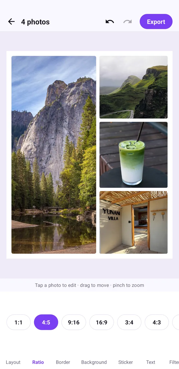
Pop Studio's collage editor has a dedicated Ratio tab. It offers 1:1, 4:5, 9:16, 16:9, 3:4, 4:3 and 5:4 as pill buttons. Tap one and the canvas reshapes immediately.
Step by step: a 9:16 Instagram Story collage
- On the home screen, tap Collage.
- In the Android photo picker, select two to four photos and tap Done.
- Open Ratio and tap 9:16 first, before decorating.
- Open Layout and choose a grid that suits a tall canvas, such as horizontal stripes stacked top to bottom.
- Drag each photo inside its cell so faces sit away from the very top and bottom of the canvas.
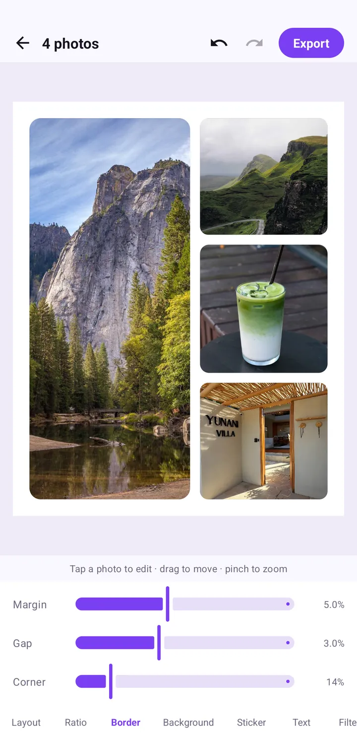
- Open Border and set Margin, Gap and Corner; a moderate margin keeps photos clear of the screen edges.
- Open Text, type your caption, and place it in the middle part of the canvas.
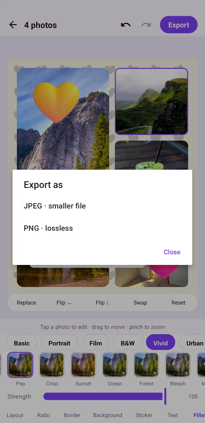
- Tap Export, choose JPEG · smaller file, then tap Instagram on the Saved screen.
Set the ratio before anything else. Changing it at the end reshapes every cell, which can push stickers and text into awkward places.
Safe zones: where apps cover your collage
A "safe zone" is the part of a vertical image that stays clear of app interface. On a 9:16 Story, the top of the screen shows the progress bar, your profile picture and name; the bottom shows the reply box and buttons. On TikTok, the right edge holds like, comment and share buttons, and the bottom carries the caption and account name.
A rule of thumb for 9:16
- Top: keep roughly the top seventh of the canvas free of text and faces.
- Bottom: keep roughly the bottom fifth free of text and important details.
- Right edge (TikTok): avoid placing captions or key stickers along the right side.
- Middle: put your caption and the most important photo here.
These numbers are approximate, because each app changes its interface from time to time, but if you keep text in the middle band you will be safe almost everywhere.
Using Border as a built-in safe zone
A simple trick: on a 9:16 collage, raise the Margin slider in Border. The background then fills the outer edge, which is exactly where interface elements appear, and your photos sit comfortably inside. Pair it with a plain or softly patterned Background so the covered areas lose nothing important.
Text that survives on a Story
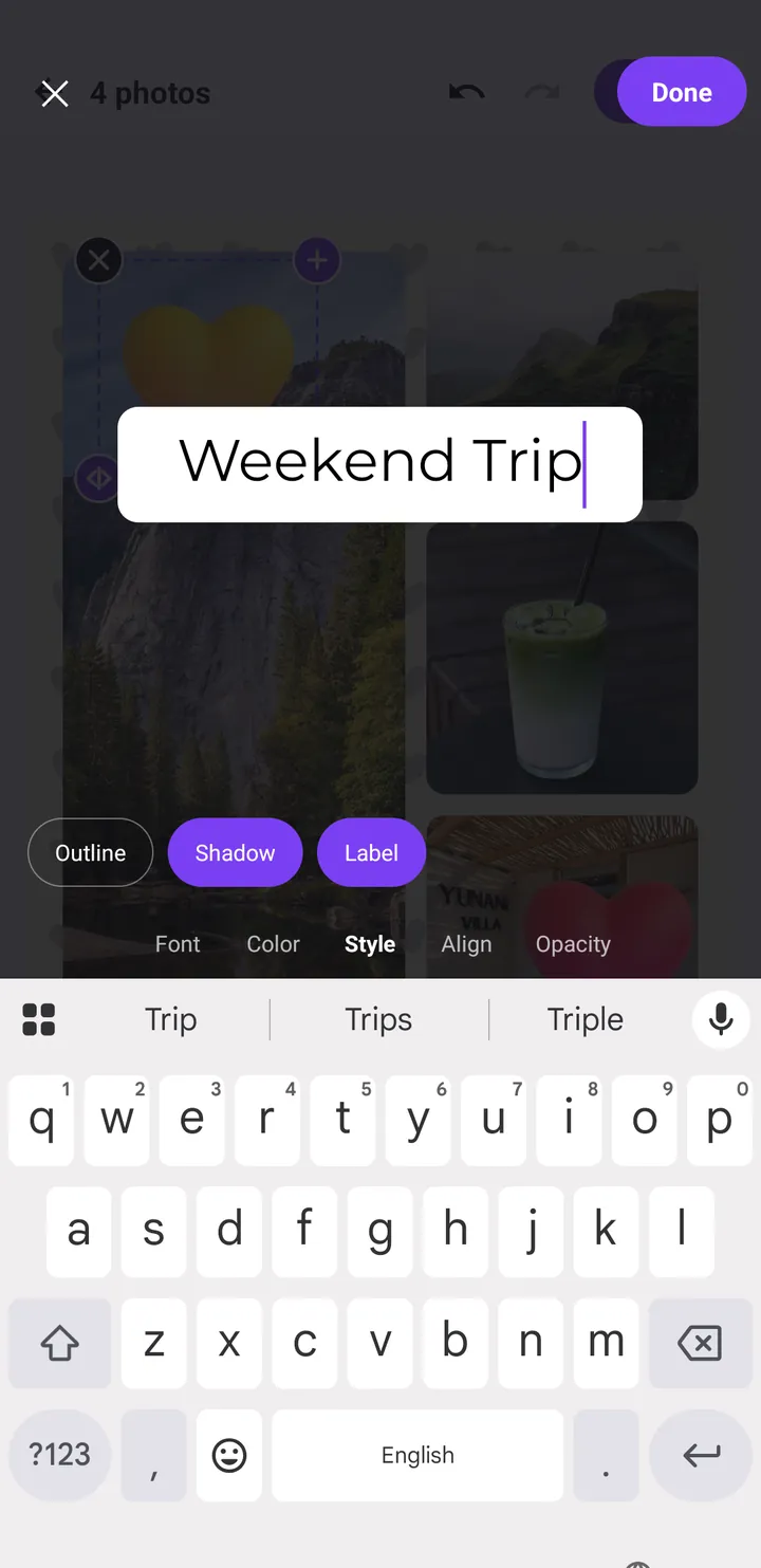
Stories are viewed for a couple of seconds, often with the thumb hovering, so captions need to be short and readable. Pop Studio's text editor has tabs for Font, Color, Style, Align and Opacity, and the Style tab offers Outline, Shadow and Label.
Readability tips
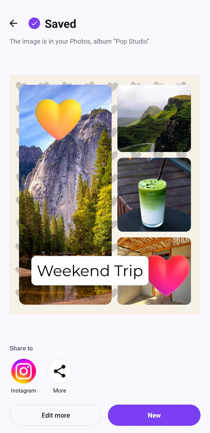
- Use Label on busy photos. It puts a solid box behind the text, as with "Weekend Trip" in our example, so it reads on any background.
- Keep it to a few words. A Story caption is a headline, not a paragraph.
- Go bigger than you think. On a full-screen 9:16 image, small text disappears.
- Remember the interface. Instagram may add its own stickers or replies near the bottom, so keep your caption above that.
The guide to adding text to photos covers fonts and colours in more depth.
Story poster templates: the fast route
If you want a designed vertical layout without building one, open Poster from Quick tools. The category row includes Birthday, Love, Friends, Story, Travel and Food. The Story category is the natural place to start for tall formats, and each card shows how many photos it needs.
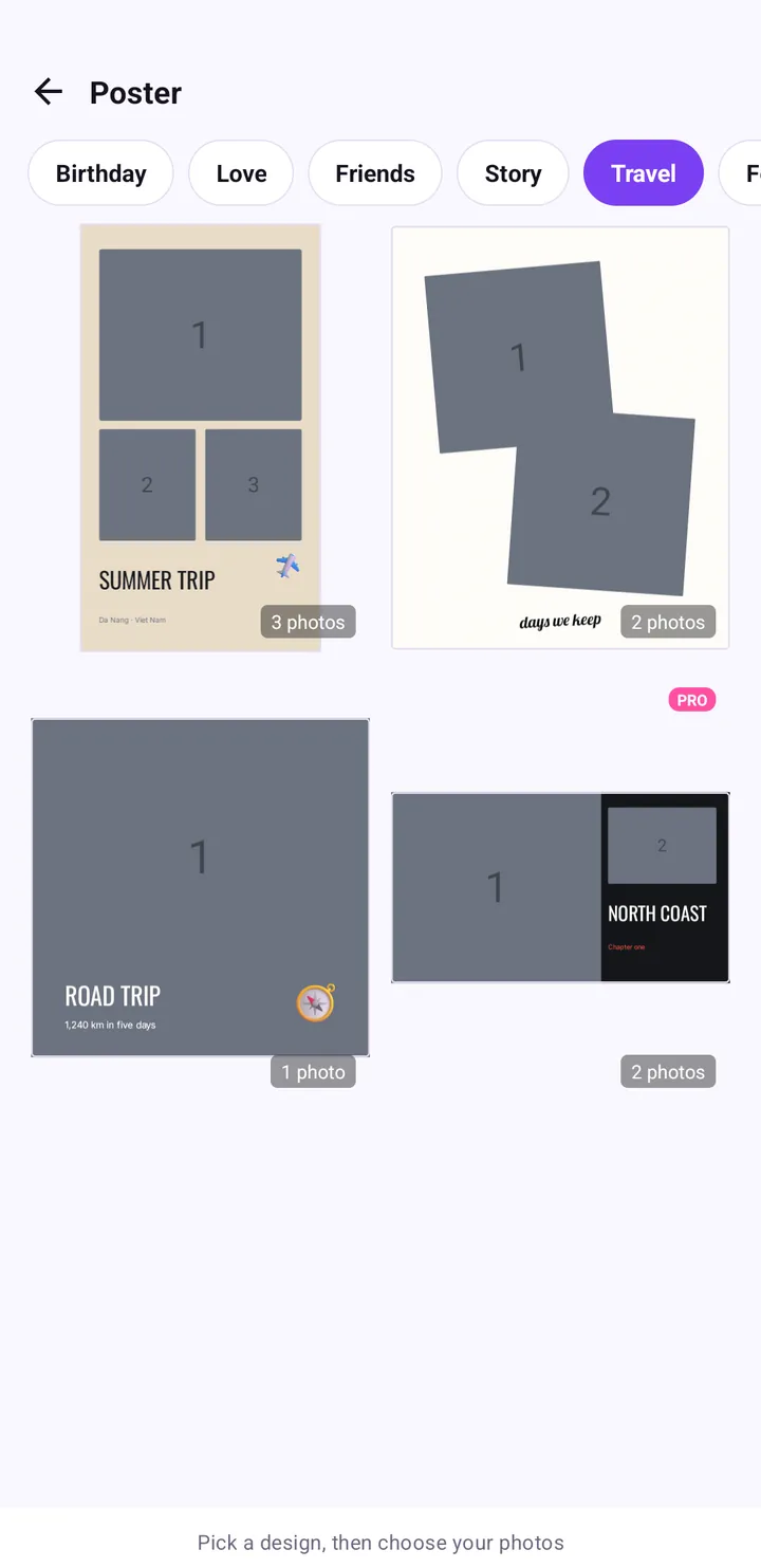
Inside the poster editor there is also a Ratio tab alongside Design, Text, Pick photos, Sticker, Filter and Adjust, so you can check the shape before exporting. For a full walkthrough, see how to make a trip poster in two minutes.
Making a TikTok photo collage
TikTok photo posts work best at 9:16. Because TikTok overlays buttons on the right and text at the bottom, the layout choice matters more than on Instagram.
- Start a Collage and set Ratio to 9:16.
- Pick a layout with stacked rows rather than many small columns, so nothing important hides behind the right-hand buttons.
- Add a short hook in Text near the upper middle, below the top edge.
- Apply one look in Filter so all photos match. The filters guide explains the categories.
- Tap Export, then More on the Saved screen to open the Android share sheet and choose TikTok.
If you plan to post several images in one TikTok photo carousel, make each collage in the same ratio so the slideshow does not jump between shapes.
Feed-ready collages: 4:5 and 1:1 done right
For the Instagram feed, open Ratio and choose 4:5. Our sample collage uses exactly that: a large landscape on the left, three smaller photos on the right, a Margin of 5%, a Gap of 3% and a Corner of 14%. It reads well in the feed and still looks balanced in the cropped grid preview because the main photo sits near the centre.
For more on spacing and backgrounds, see ratio, border and background explained.
One collage, several destinations
If you want the same photos as both a feed post and a Story, make the feed version first at 4:5 and export it. Then tap Edit more on the Saved screen, switch Ratio to 9:16, adjust photo positions and text placement, and export again. You end up with two correctly shaped files instead of one that gets cropped.
Choosing a layout for a tall canvas
Not every layout suits 9:16. When the canvas is almost twice as tall as it is wide, each layout choice feels very different.
Stacked horizontal stripes
The safest option for Stories. Each photo spans the full width of the screen and the eye moves from top to bottom like reading a story. Great for landscapes, overhead food shots and a sequence of moments from one day.
Vertical columns
On a 9:16 canvas, columns become very tall, narrow strips. Use them only when your photos are already portrait-shaped, like full-length outfit shots or tall drinks, and keep it to three columns or fewer.
One large photo with a few small ones
The layout with one big photo on the left and three on the right looks great at 4:5, but at 9:16 the small cells stretch. If you keep it, check every cell after changing the ratio and drag photos so subjects stay centred. When in doubt, try a few options in Layout; the undo arrow is always there.
Common mistakes
- Posting a 1:1 collage to Stories. It will appear small with empty space around it. Re-export at 9:16 instead.
- Captions at the very top or bottom. They will sit under the profile picture or reply box. Move them to the middle band.
- Too many tiny cells. Nine photos on a phone screen viewed for two seconds is a lot. For Stories, two to four photos usually read better.
- Changing ratio after decorating. Set the shape first, then add stickers and text.
- Choosing PNG for a quick Story. PNG is lossless but larger. For social sharing, JPEG · smaller file is usually the better pick.
Wrap-up
Pick the shape by destination: 9:16 for Stories and TikTok, 4:5 for the Instagram feed, 1:1 when you want one file that works everywhere. Set it first in the Ratio tab, use Margin to keep photos clear of the edges, and keep captions in the middle band with Label or Shadow for readability. Then export, tap Instagram or More, and post. Everything is processed on your phone; our privacy policy explains the details.
Frequently asked questions
What size should an Instagram Story collage be?
Use a 9:16 ratio so the collage fills the whole phone screen. In Pop Studio, open the Ratio tab and tap 9:16 before decorating.
Is 4:5 or 1:1 better for an Instagram feed post?
4:5 takes up more screen as people scroll, so it is usually the better choice. 1:1 is a safe fallback when you want one file for several apps.
What is a safe zone on Stories and TikTok?
It is the area not covered by app interface. As a rule of thumb, keep text and faces out of roughly the top seventh and bottom fifth of a 9:16 image, and away from the right edge on TikTok.
How do I share a collage to Instagram or TikTok?
After you export, the Saved screen shows an Instagram button and a More button. More opens the Android share sheet, where you can choose TikTok or any other app.
Keep reading
Collage border spacing, ratio and background colour, explained
How the Ratio, Border and Background tabs work: which ratio to choose for feed or Stories, the Margin, Gap and Corner settings that look clean, and how to pick a background.
Read the guide →Add Text to Photos on Android: Fonts, Styles and Placement
How to put a clean, readable caption on any collage or poster in Pop Studio, from the Font, Color, Style, Align and Opacity options to placement and typography tips.
Read the guide →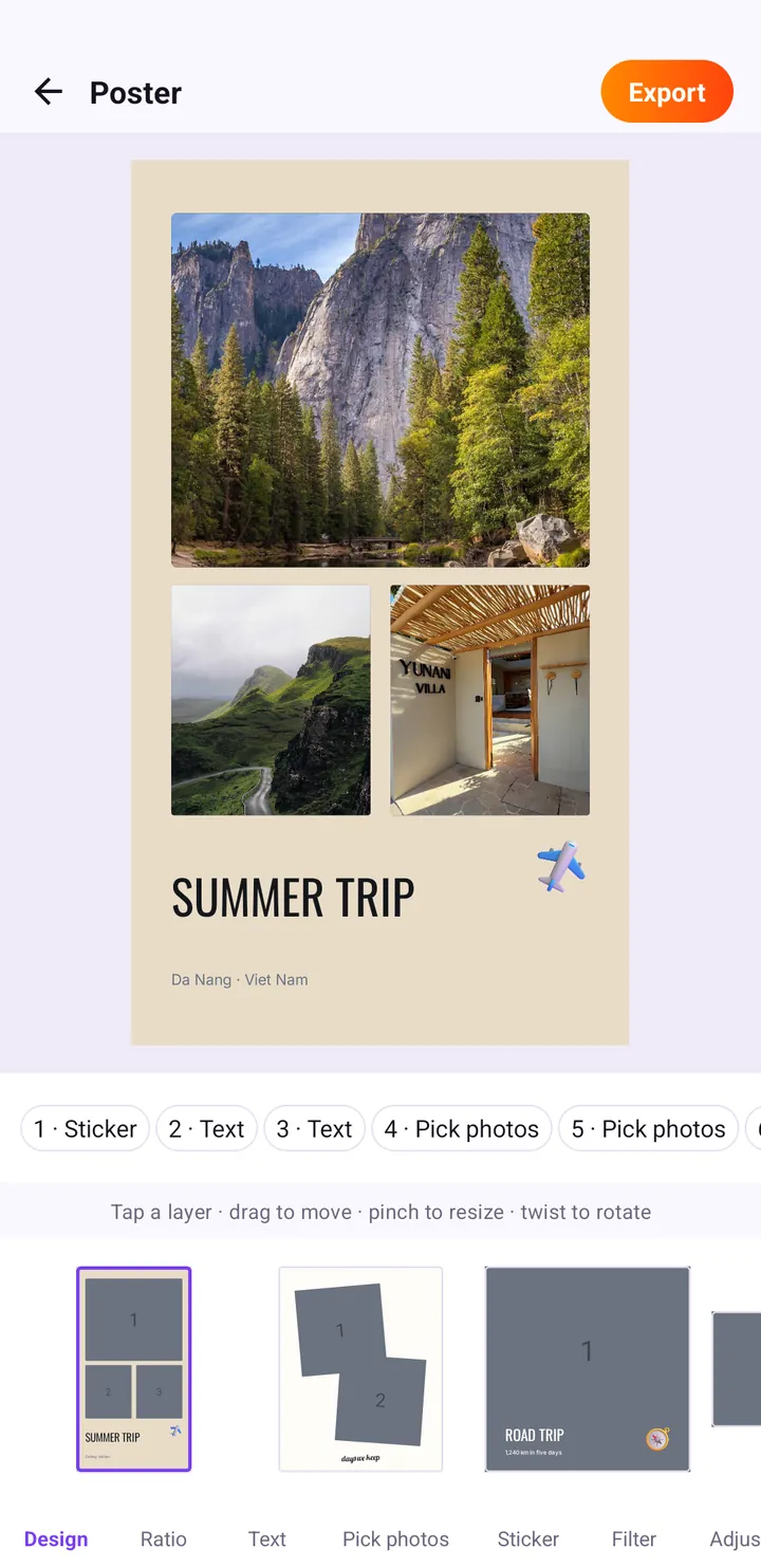
Poster Templates: Make a Summer Trip Travel Poster Fast
Turn your trip photos into a finished travel poster with Pop Studio's poster templates. We build a SUMMER TRIP poster step by step, then personalise it.
Read the guide →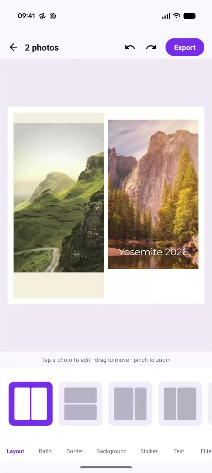
Pop Studio in action: a two-photo collage in 20 seconds
Recorded on a Pixel 10 Pro XL: one two-photo collage, side-by-side, stacked and unequal layouts, the Margin, Gap and Corner sliders, and cream versus black backgrounds, with a timestamped breakdown and steps to make your own.
Read the guide →