 Pop Studio
Collage border spacing, ratio and background colour, explained
How the Ratio, Border and Background tabs work: which ratio to choose for feed or Stories, the Margin, Gap and Corner settings that look clean, and how to pick a background.
Two collages can use exactly the same photos and still look completely different. One feels cramped and cut off; the other feels calm, deliberate and ready to post. The difference is rarely the photos themselves. It is the frame around them: the shape of the canvas, the collage border spacing between the pictures, the roundness of the corners and the background colour or pattern that holds everything together.
Pop Studio puts all of that in three tabs of the collage editor: Ratio, Border and Background. In this guide you will learn what each option does, which ratio to choose for a feed post or an Instagram Story collage, how to set Margin, Gap and Corner so the spacing looks professional, and how to pick a collage background colour or pattern that flatters your photos rather than fighting them.
We will use a real four-photo collage throughout, the same one you see in the screenshots, so every number we mention is one you can reproduce on your own phone.
Where Ratio, Border and Background live
Start a collage from the home screen by tapping Collage, pick your photos in the Android photo picker and tap Done. The editor opens with the canvas in the middle, an Export button at the top right, undo and redo arrows next to it, and a tab bar along the bottom: Layout, Ratio, Border, Background, Sticker, Text and Filter.
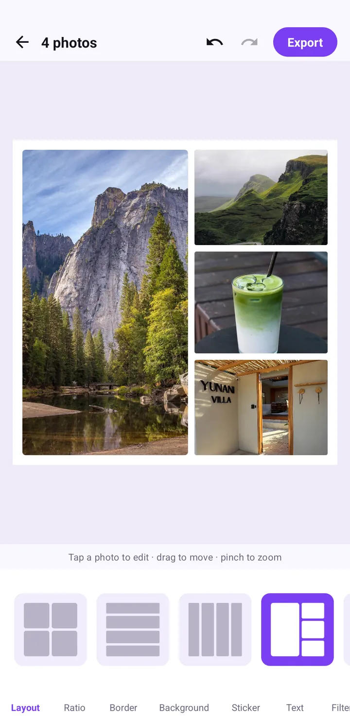
The order of those tabs is a good order to work in. Choose the grid in Layout first (the photo collage maker guide covers that step), then set the shape with Ratio, the spacing with Border, and finally the backdrop with Background. Decorations like stickers and text come after, once the structure is settled.
A hint line above the tabs reads "Tap a photo to edit · drag to move · pinch to zoom". You can reposition each photo inside its cell at any time, which matters once you change the ratio, because cells change shape with it.
Ratio: sizing your collage for feed, Stories and more
The Ratio tab shows a row of pill buttons. In the current version you will see 1:1, 4:5, 9:16, 16:9, 3:4, 4:3 and 5:4, and the row scrolls if there are more. Tap one and the whole canvas reshapes immediately, with the layout adapting to the new size.
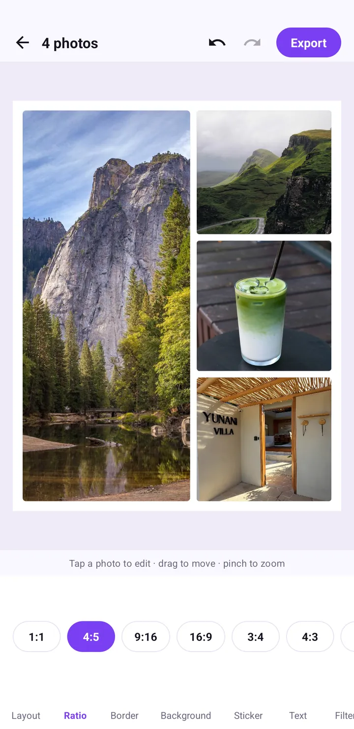
Which ratio for which place
| Ratio | Shape | Good for |
|---|---|---|
| 1:1 | Square | Classic feed posts, profile-friendly grids, messaging apps |
| 4:5 | Slightly tall | Feed posts that take up more screen space on a phone |
| 3:4 | Tall | Portrait-heavy collages, prints, tall feed posts |
| 9:16 | Full-screen tall | Instagram Stories, TikTok photo posts, Reels covers, phone wallpapers |
| 16:9 | Wide | Landscape panoramas, video thumbnails, desktop wallpapers |
| 4:3 and 5:4 | Slightly wide | Landscape sets, printed photo-book pages |
If you are making something specifically for Stories or TikTok, read our deeper guide on 9:16 vs 4:5 vs 1:1 and safe zones. It covers where app buttons cover your image and how to keep text out of those areas.
How ratio changes your layout
Switching from 4:5 to 9:16 stretches every cell vertically. A layout with one big photo on the left and three stacked on the right works beautifully at 4:5, and at 9:16 the three right-hand cells become tall slivers. After changing the ratio, it is worth glancing at each cell and dragging photos so faces and key details stay centred. If a layout no longer suits the new shape, simply go back to Layout and pick another grid.
Border: Margin, Gap and Corner
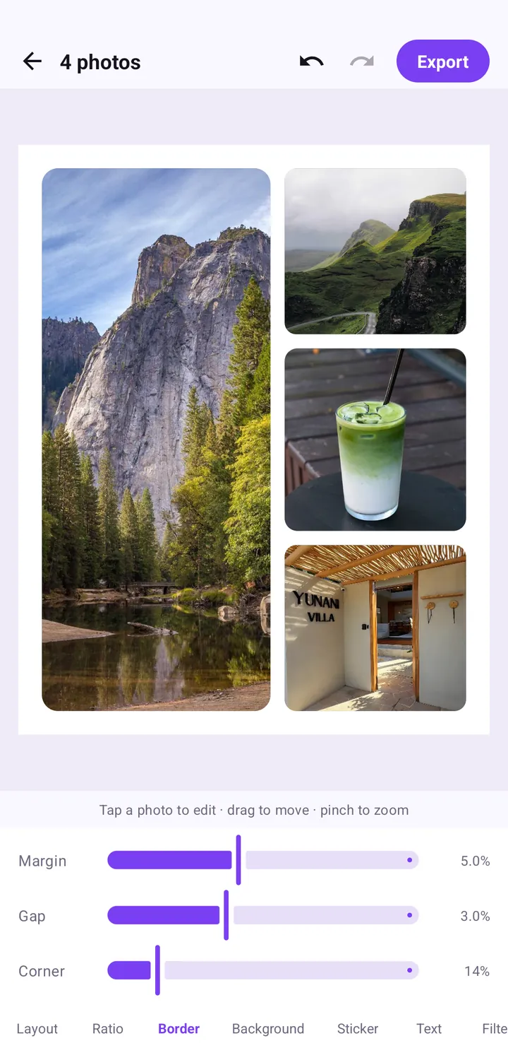
The Border tab is where collage border spacing happens. It has three sliders, each showing its value as a percentage on the right:
- Margin: the outer space between the photos and the edge of the canvas.
- Gap: the space between the photos themselves.
- Corner: how rounded each photo's corners are.
A setting that works almost everywhere
The screenshot shows Margin 5.0%, Gap 3.0% and Corner 14%. That combination is a reliable default: the outer margin is a little wider than the gaps, which frames the collage like a mount around a print, and the rounded corners soften the grid without turning photos into bubbles.
Why margin should be wider than gap
When the outer margin is equal to or narrower than the gaps between photos, the collage tends to look like it is spilling off the canvas. Keeping Margin slightly larger than Gap gives the eye a clear edge. A good rule of thumb is a margin around one and a half to two times the gap.
Three styles to try
- Seamless: Margin and Gap near zero, Corner at zero. Photos touch each other edge to edge, like a mosaic. Great for a dense travel recap.
- Clean card: a moderate Margin, a smaller Gap and a medium Corner, as in the screenshot. Works for almost anything.
- Playful bubbles: a generous Gap and a high Corner. Photos float on the background like stickers, which suits birthdays and cute themes.
Background: colours and patterns behind your photos
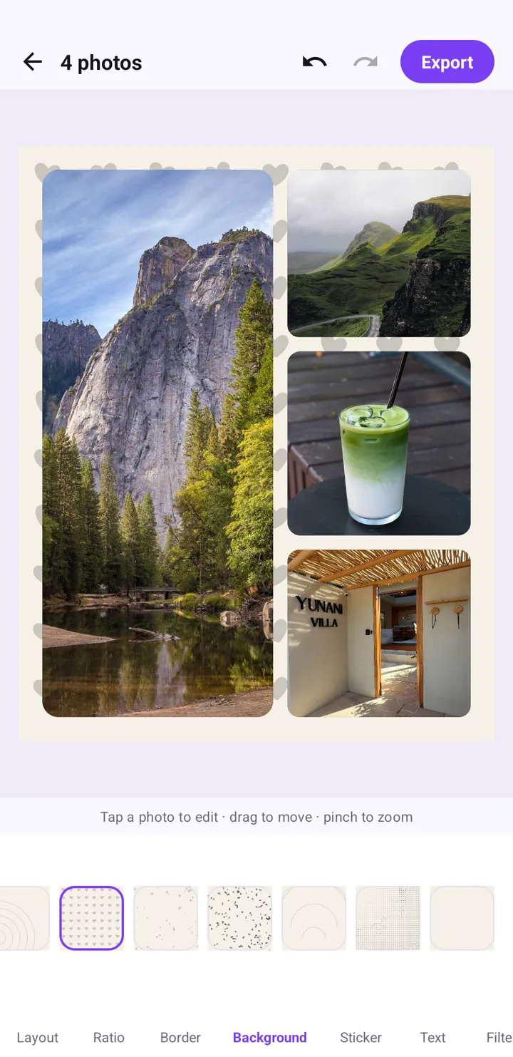
The Background tab controls what shows through the margin and gaps. It offers a row of swatches you can scroll sideways, from soft plain tones to subtle patterns. In the screenshot below, a light hearts pattern on a cream base is applied, and you can see the little hearts peeking out between the photos.
How background interacts with Border
Background only matters if there is space for it to show. With Margin and Gap at zero you will barely see it. If you choose a patterned background, give it room: increase the Margin a little so the pattern reads as a deliberate frame rather than noise between photos.
Choosing a collage background colour
- Pick from the photos. A background that echoes a colour already in your pictures (sand, sky, a drink) ties everything together.
- Neutral for busy photos. If your photos are colourful, a plain light tone lets them breathe.
- Pattern for simple photos. Minimal photos, like a single coffee cup or a plain wall, can carry a playful pattern.
- Match the theme. The hearts pattern is a natural fit for couple or birthday collages.
Step by step: a feed-ready collage with clean spacing
Here is the complete flow we used to make the collage in these screenshots.
- On the home screen, tap Collage.
- Select four photos in the picker and tap Done.
- In Layout, choose the grid with one large photo on the left and three stacked on the right.
- Open Ratio and tap 4:5.
- Drag each photo inside its cell so the main subject sits in the middle.
- Open Border and set Margin to about 5%, Gap to about 3% and Corner to about 14%.
- Open Background and tap a swatch; try a plain tone first, then a pattern, and compare.
- Optionally add a sticker, a caption in Text and a look in Filter.
- Tap Export, choose JPEG · smaller file or PNG · lossless, and the collage is saved to your Photos.
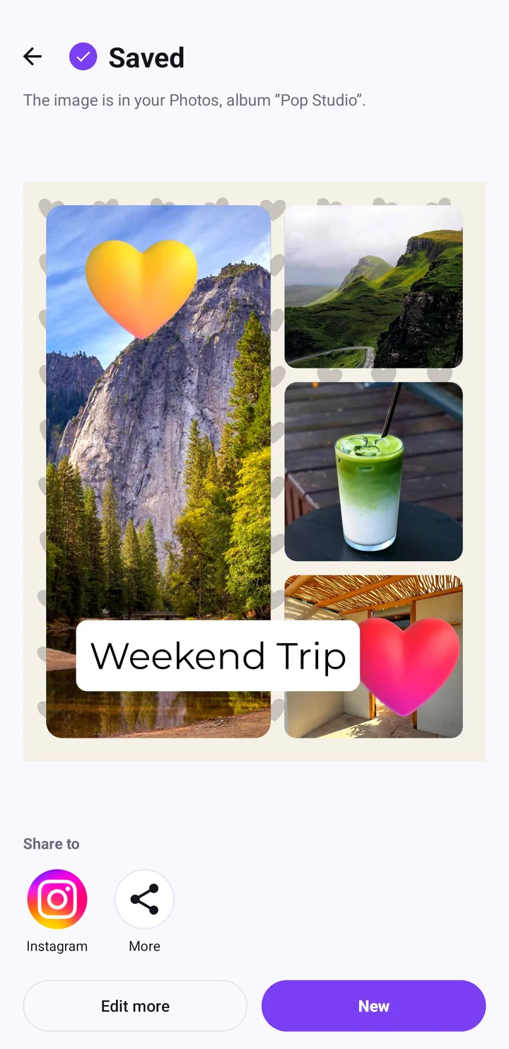
The finished version also uses heart stickers and a "Weekend Trip" label; the stickers guide and the text on photos guide explain how to add those.
Ready-made combinations to copy
If you would rather start from a working recipe than experiment, here are four combinations of ratio, border and background that suit common situations. Treat the numbers as starting points and adjust by eye.
The calm feed post
Ratio 4:5, Margin about 5%, Gap about 3%, Corner about 14%, and a plain light background. This is the safest choice for a weekend recap or a set of outfit photos, and it is exactly what our sample collage uses before decoration.
The square mosaic
Ratio 1:1, Margin and Gap at or near zero, Corner at zero. With no visible background, the photos read as one continuous image. Choose this for nine-photo trip grids.
The cute card
Ratio 4:5 or 1:1, a wider Margin, a generous Gap, a high Corner and a patterned background such as hearts. The pattern frames each photo like a sticker on a page. Ideal for birthdays and couples; see our collage ideas for more themed recipes.
The tall Story
Ratio 9:16, a moderate Margin, a small Gap and a plain background. Keep the top and bottom of the canvas simple, because that is where apps place their own buttons and profile info.
Whichever you choose, remember that every slider can be undone with the arrows at the top of the editor, so there is no risk in trying something bold.
Common mistakes with ratio, border and background
Changing the ratio last
Ratio changes the shape of every cell. If you have already placed photos perfectly and added text, switching the ratio at the end means re-checking everything. Set it early.
Zero margin with a pattern
A pattern squeezed into thin gaps looks like a rendering glitch. Either give it margin, or use a plain colour.
Corner too high on small cells
A high Corner value on a layout with many small cells can make them look like circles. If you are using six or more photos, keep Corner lower than you would for a two- or four-photo collage.
Background fighting the filter
If you later apply a cool filter like Ocean, a warm cream background might start to look yellow next to it. When you change the filter, take another look at the background. Our filters guide covers how the categories behave.
Wrap-up
Ratio decides where your collage will look best, Border decides how calm or playful it feels, and Background ties the colours together. Set them in that order, keep the Margin slightly larger than the Gap, and choose a background that either echoes your photos or stays out of their way. With those three tabs set, the stickers, text and filters you add afterwards will look intentional.
Questions about a specific setting? Our support page is the place to ask.
Frequently asked questions
Which collage ratio should I use for an Instagram post?
4:5 fills more of the screen in the feed, while 1:1 is the classic square. For Stories and TikTok, choose 9:16.
How do I add space between photos in a collage?
Open the Border tab and drag the Gap slider. Margin controls the space around the outside edge, and Corner rounds the photo corners.
What are good border settings for a collage?
A reliable starting point is Margin around 5%, Gap around 3% and Corner around 14%. Keeping the margin a little wider than the gap gives the collage a clean edge.
Can I use a pattern as the collage background?
Yes. The Background tab includes plain tones and patterns such as hearts. Give a pattern some Margin so it reads as a frame.
Keep reading
Instagram Story collage guide: 9:16 vs 4:5 vs 1:1 and safe zones
How to make collages that fit Instagram Stories, TikTok and the feed the first time: choosing 9:16, 4:5 or 1:1, keeping text inside the safe zone, and sharing straight from the Saved screen.
Read the guide →How to Make a Photo Collage on Android: Layouts and Spacing
A step-by-step guide to building a balanced photo collage in Pop Studio: choosing layouts, framing photos in each cell, picking a ratio and getting the spacing right.
Read the guide →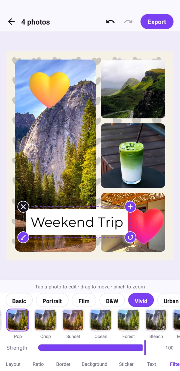
Photo filters explained: Pop, Crisp, Sunset and every category
A tour of the Filter tab: what each category is for, how the Vivid looks like Pop, Crisp, Sunset and Bleach differ, and how to use the Strength slider so a filter looks natural.
Read the guide →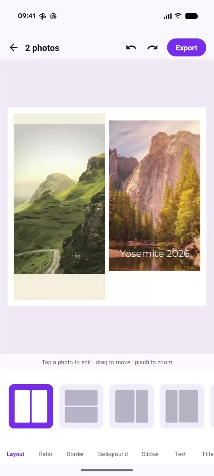
Pop Studio in action: a two-photo collage in 20 seconds
Recorded on a Pixel 10 Pro XL: one two-photo collage, side-by-side, stacked and unequal layouts, the Margin, Gap and Corner sliders, and cream versus black backgrounds, with a timestamped breakdown and steps to make your own.
Read the guide →